2nd year project
The brief
Make a game based on Big Brother
Not much direction, but that’s ok, how hard could it be to make a Big Brother game? Well
The reality
So it turns out there are no Big Brother games, not really. My team and I (all of whose sites I will link to at the bottom) quickly found that it would require either an accurate recreation of The Sims or a horrendously large writing job.

It was at this moment that a lecturer leaned into the conversation and in no uncertain terms forbade us from making The Sims. Alright. Good. Following a brief wave of relief we all looked at our writer who, in blissful ignorance, did not look worried. He would watch the show and he would understand our panic.
Lucky me
As roles were divvied out I quickly latched onto Art Direction. Now there is no denying that I can barely write my name, draw a stick-man or tell acrylic from oil, but throw me on Photoshop and I’ll be happy and, given a little time, you’ll see results. Just don’t look over my shoulder!
So onto the main menu. I liked the simplicity of Windows Phone menus, and it seemed like something I could emulate. The all-seeing eye, the iconic hallmark of Big Brother, had to feature prominently as well.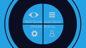
The eye surrounds the menu with the player being pushed in at launch to see it. The colour scheme is shamelessly lifted from Windows Phones and the icons are not exactly what you’d call royalty free but it’s simple and functional.
With Big Brother being so strongly driven by the inter-housemate drama, the next screen I mocked up was the interaction screen, continuing with the same colour palette and the minimal UI.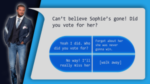
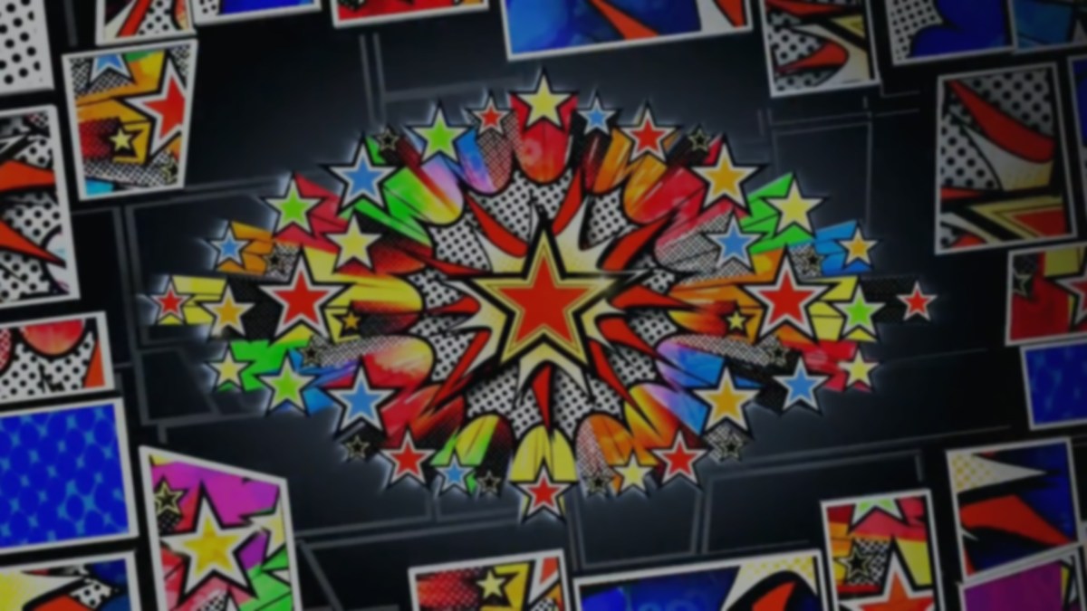
Unfortunately doing a bit of digging, one quickly finds that each season of the show is very distinct in its art style. Some have been Steampunk inspired, some Halloween and some have had the simple techy look I was going for. This season’s theme was pop-art.
Back to the drawing board
A bit of research and a bunch of trial-and-error and I finally realised that pop art is harder to recreate than it looks, and the style that the show had chosen was even busier than the classics. Below is the revamped eye, as used in the show, in all its intimidating glory.
A little worrying right? Well, with deadlines fast approaching there was no way I could copy the style exactly, so I decided on a more block-colour approach using custom bubbles and colours from the eye.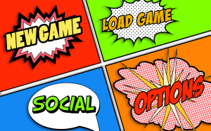
But that felt a little too removed from, a little too primary school compared to the stylised-screen aesthetic they had established in the show.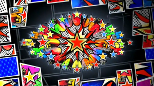
So the menu got a little darker: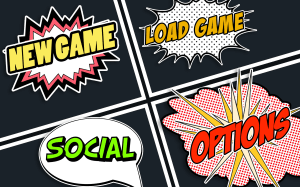
As did the interaction screen: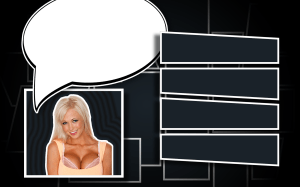
Now that’s a bit better. I’m now well into making the gameplay demonstration video, but you won’t get a look at that for another few weeks.
There’s still a ways to go but the project is coming together in a wonderfully seamless way. I couldn’t have been given better teammates and, though I don’t really mention above, their input throughout this process cannot be overstated. Here are their portfolios:
Lead Writer: Sven Ulrich
Lead Programmer: Hoyung Ling
Lead Researcher & Co-Programmer: Adam Spike
